Login Form
Two design variants — classic split-screen and gradient card — implemented across React, Vue, and Lit.
Variant I — Split Screen
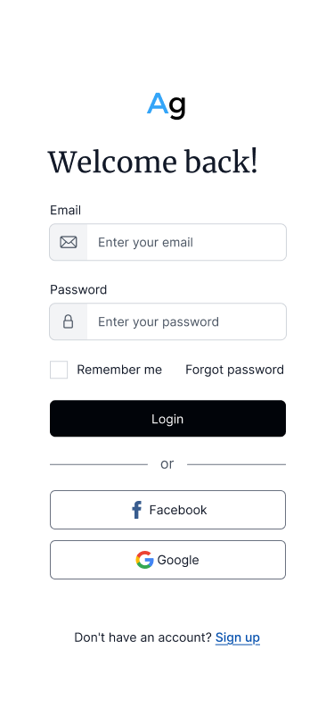
Mobile
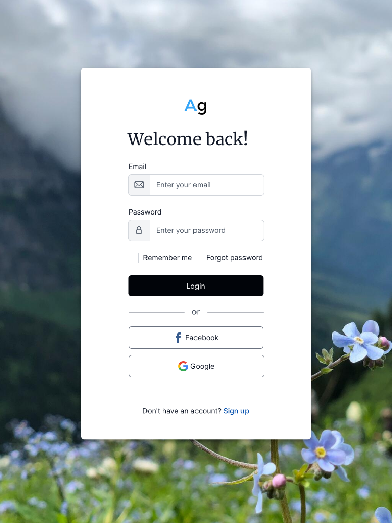
Tablet
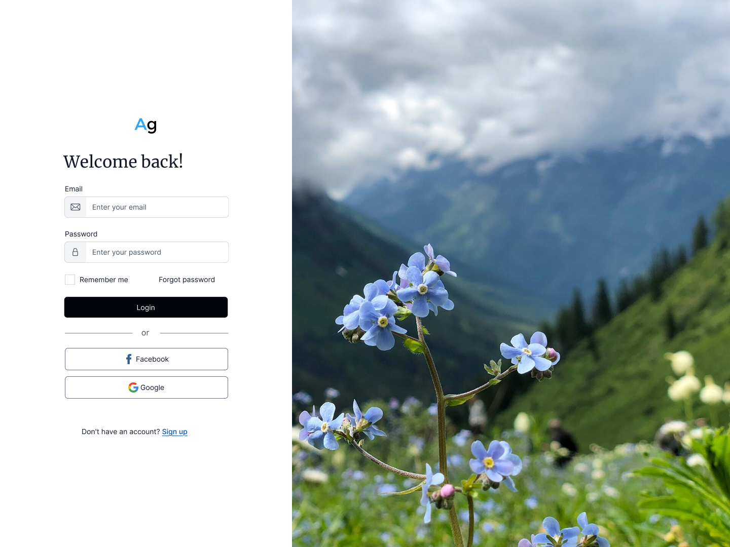
Desktop
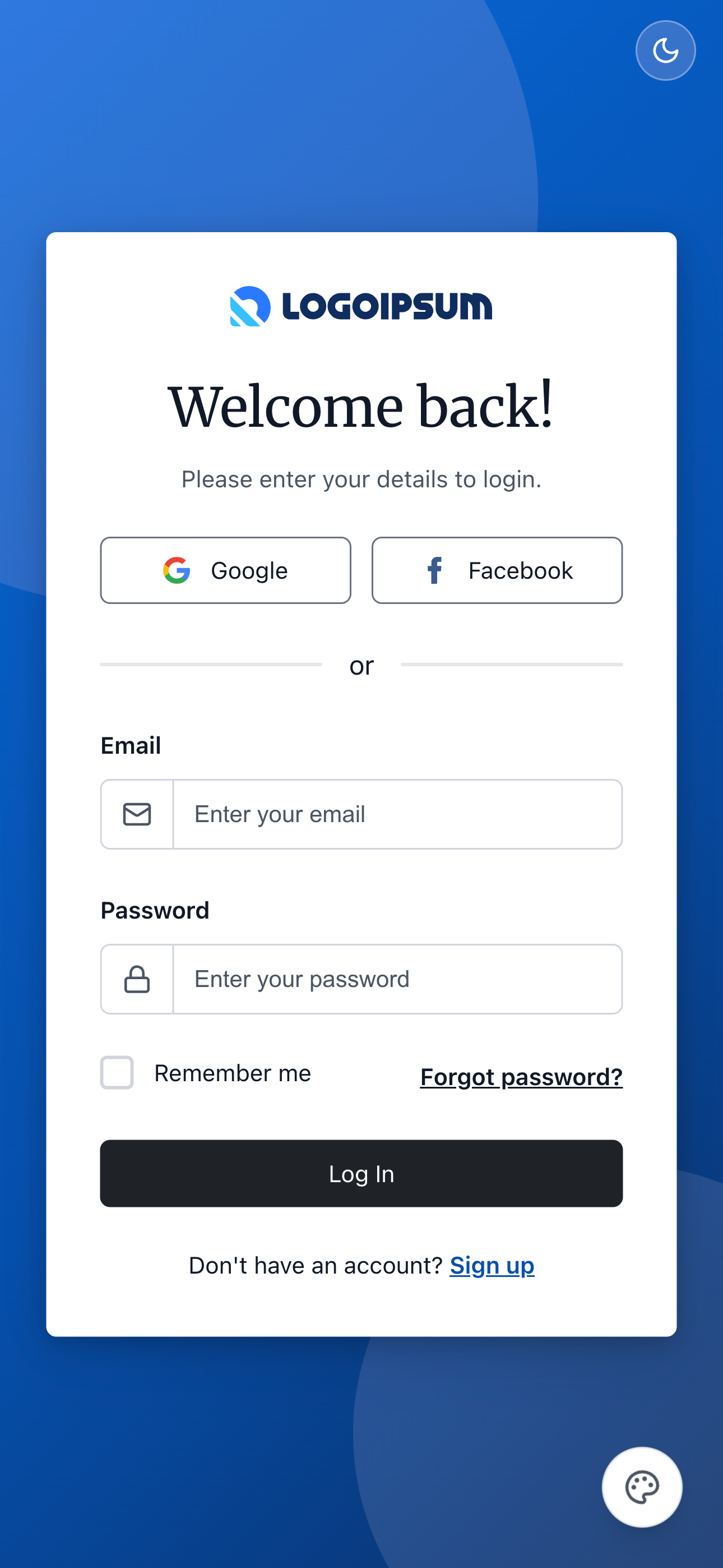
Variant II — Gradient Card
SSO-first layout with a full-bleed gradient background and floating card on all breakpoints.
Mobile
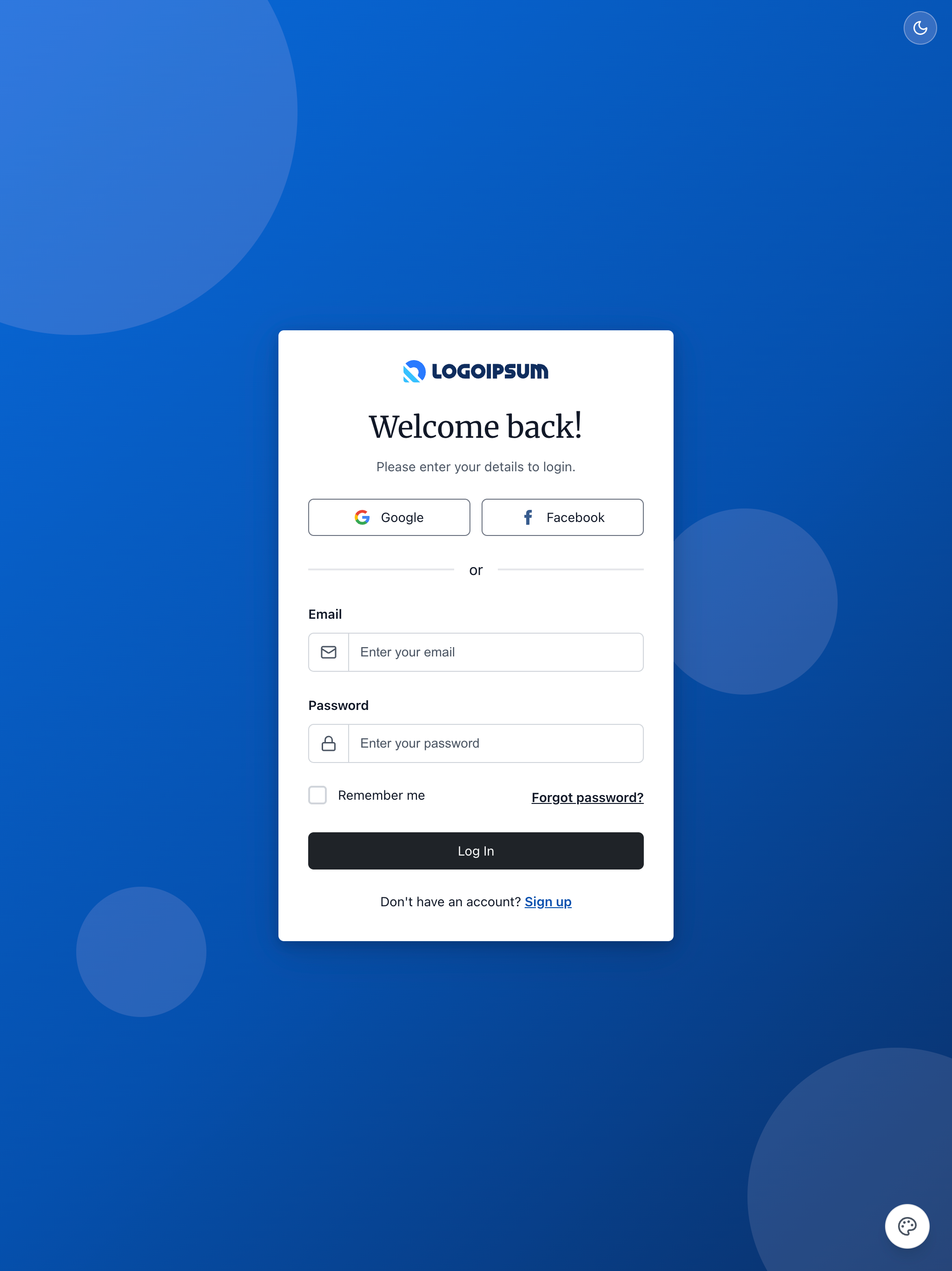
Tablet
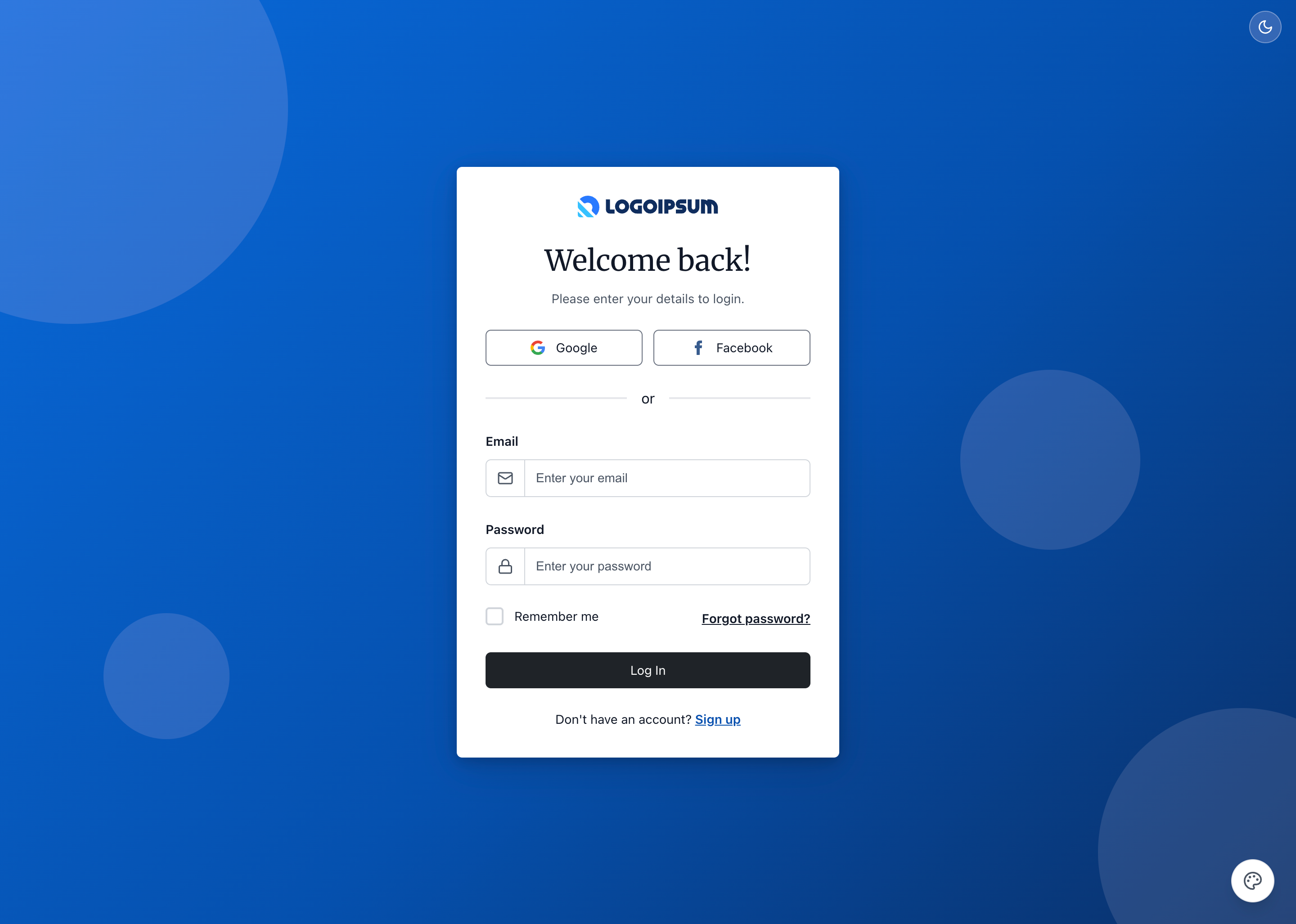
Desktop
Skins & Customization
Screenshots show the default skin. Each live example includes a skin switcher (bottom-right corner) to preview other themes instantly. Colors, spacing, and typography are fully customizable via design tokens.
What's Included
Experimental Feature: AI-Assisted UI Generation
Generating UI components via LLM prompting is non-deterministic; different models (and even different versions of the same model) can produce drastically varying results from identical prompts.
While these prompts have been tested using the Claude Code CLI (running Claude Sonnet 4.5 and Opus 4.5), the output remains experimental. Always verify generated code for visual consistency, accessibility, and production readiness before deployment.
- Two design variants × three frameworks: six implementations in total
- Variant I — classic split-screen (photo hero + form); mobile, tablet, desktop responsive layouts
- Variant II — SSO-first gradient card; floating card visible on all breakpoints
PROMPT-3-FRAMEWORKS.md: LLM prompt for Variant I (all three frameworks)PROMPT-3-FRAMEWORKS-V2.md: LLM prompt for Variant II (all three frameworks)PROMPT-VUE.md: LLM prompt to generate Vue login page.PROMPT-REACT.md: LLM prompt to generate React login page.PROMPT-LIT.md: LLM prompt to generate Lit login page (web components so use this for other frameworks like Svelte, Angular, etc.).
Using with an LLM
The PROMPT-3-FRAMEWORKS.md file contains everything an AI assistant needs to understand and modify the login form:
- Copy the
PROMPT-3-FRAMEWORKS.mdcontents - Paste into Claude, ChatGPT, or your preferred LLM
- Ask for customizations: "Change the social buttons to Apple and GitHub sign-in"
Framework-Specific Prompts
You can follow these same steps for the framework-specific prompts located in the <root>/v2/playbooks/login/ directory:
These versions use unique assets—such as different logos, background images, and Google fonts—to demonstrate how to customize the Login Playbook for your specific needs.
Components Used
| Component | Purpose |
|---|---|
ag-button | Login and social sign-in buttons |
ag-input | Email and password fields with icon addons |
ag-checkbox | "Remember me" option |
ag-link | "Forgot password?" and "Sign up" links |
ag-divider | "or" separator |
ag-card | Floating card on tablet breakpoint |
Responsive Behavior
Variant I
| Breakpoint | Layout |
|---|---|
| Mobile (<768px) | Form only, white background |
| Tablet (768-1199px) | Floating card over full-bleed background |
| Desktop (≥1200px) | Two-column: 40% form / 60% hero image |
Variant II
| Breakpoint | Layout |
|---|---|
| Mobile (<640px) | Floating card (375px) on gradient background |
| Tablet/Desktop (≥640px) | Floating card (425px) on gradient background |