Discovery Dashboard
A responsive post‑onboarding dashboard that surfaces user interests and actions, showcasing a consistent, token‑driven UI in React, Vue, and Lit.
Try it Live
Open any framework example directly in StackBlitz:
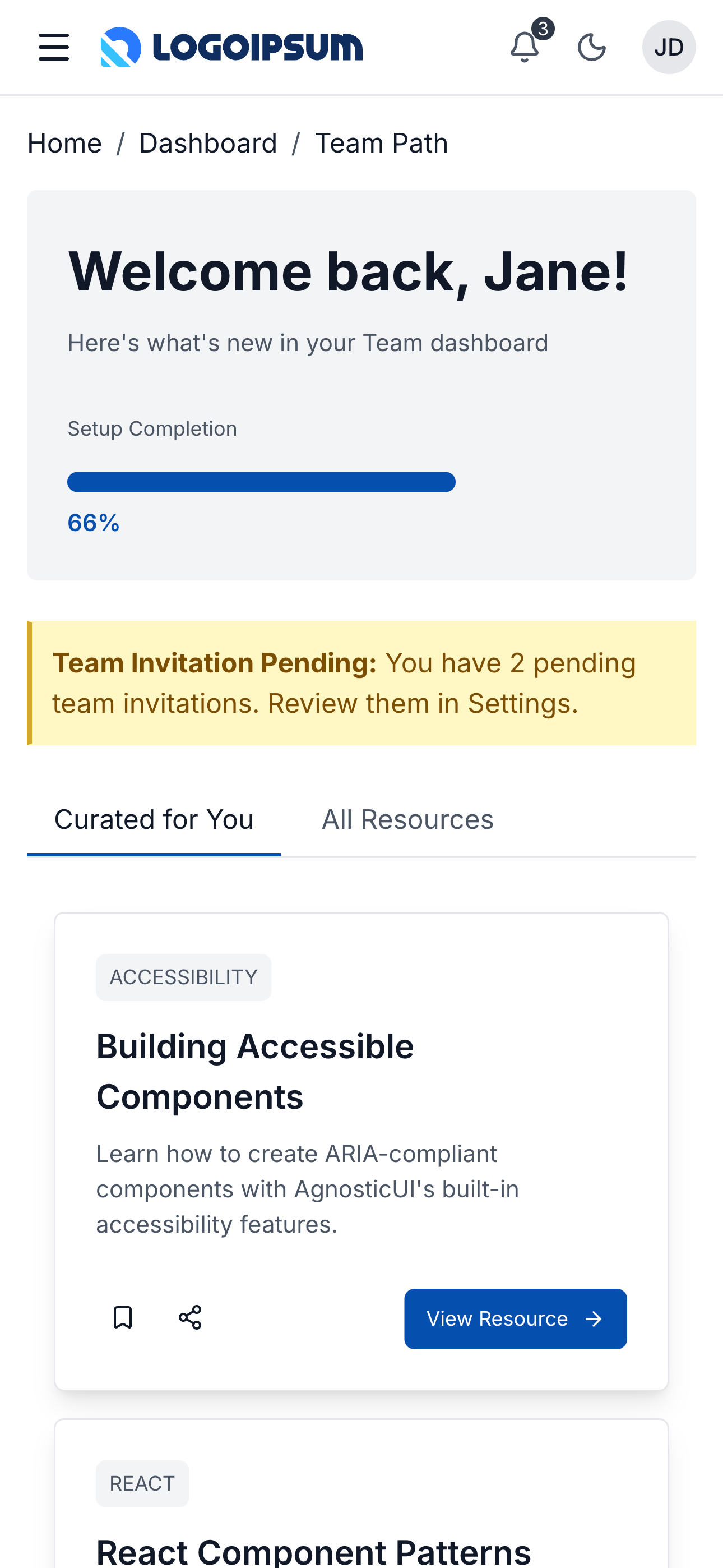
Mobile
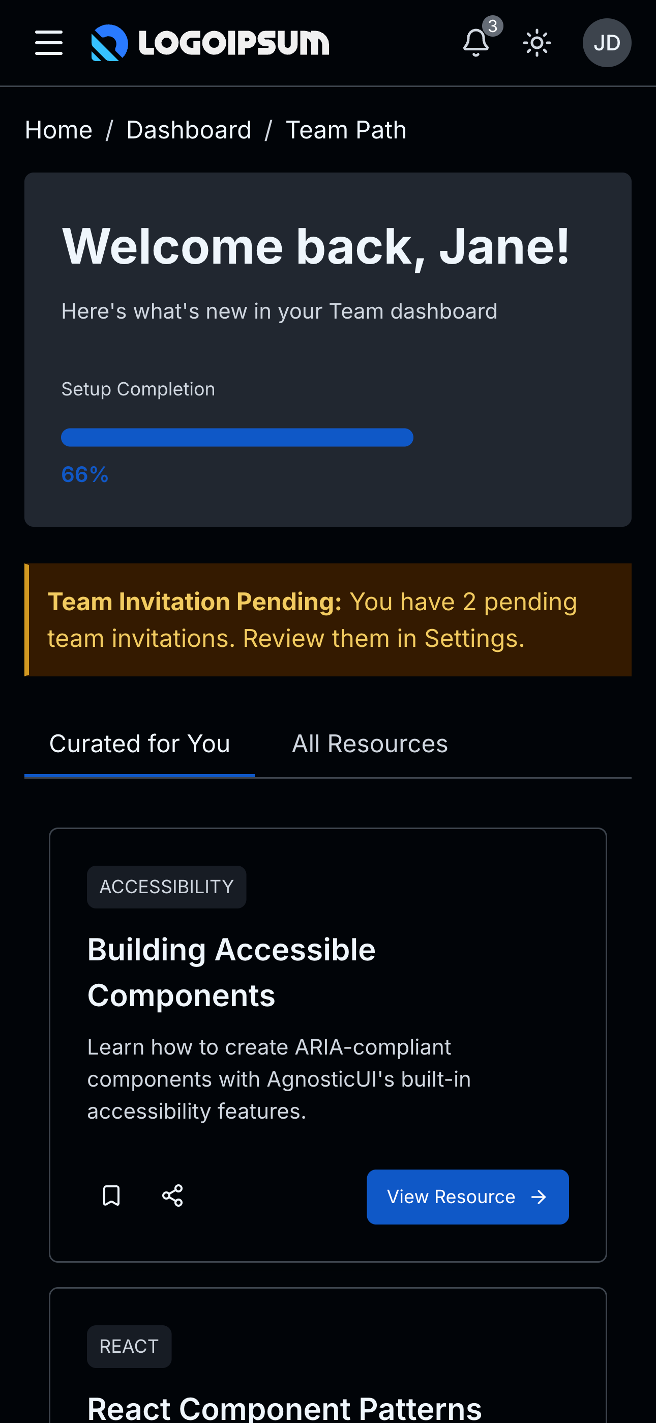
Mobile - Dark
Tablet
Tablet - Dark
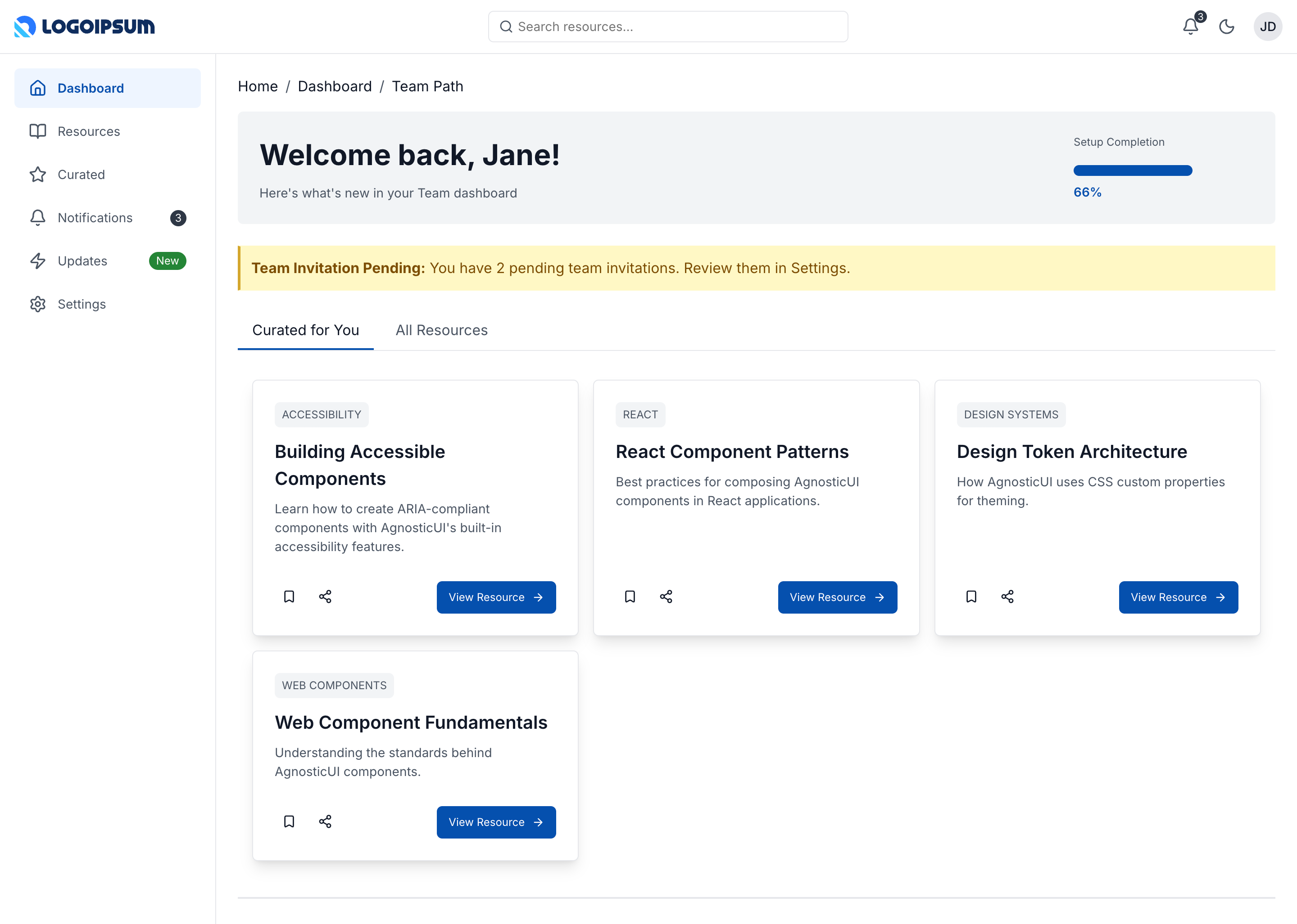
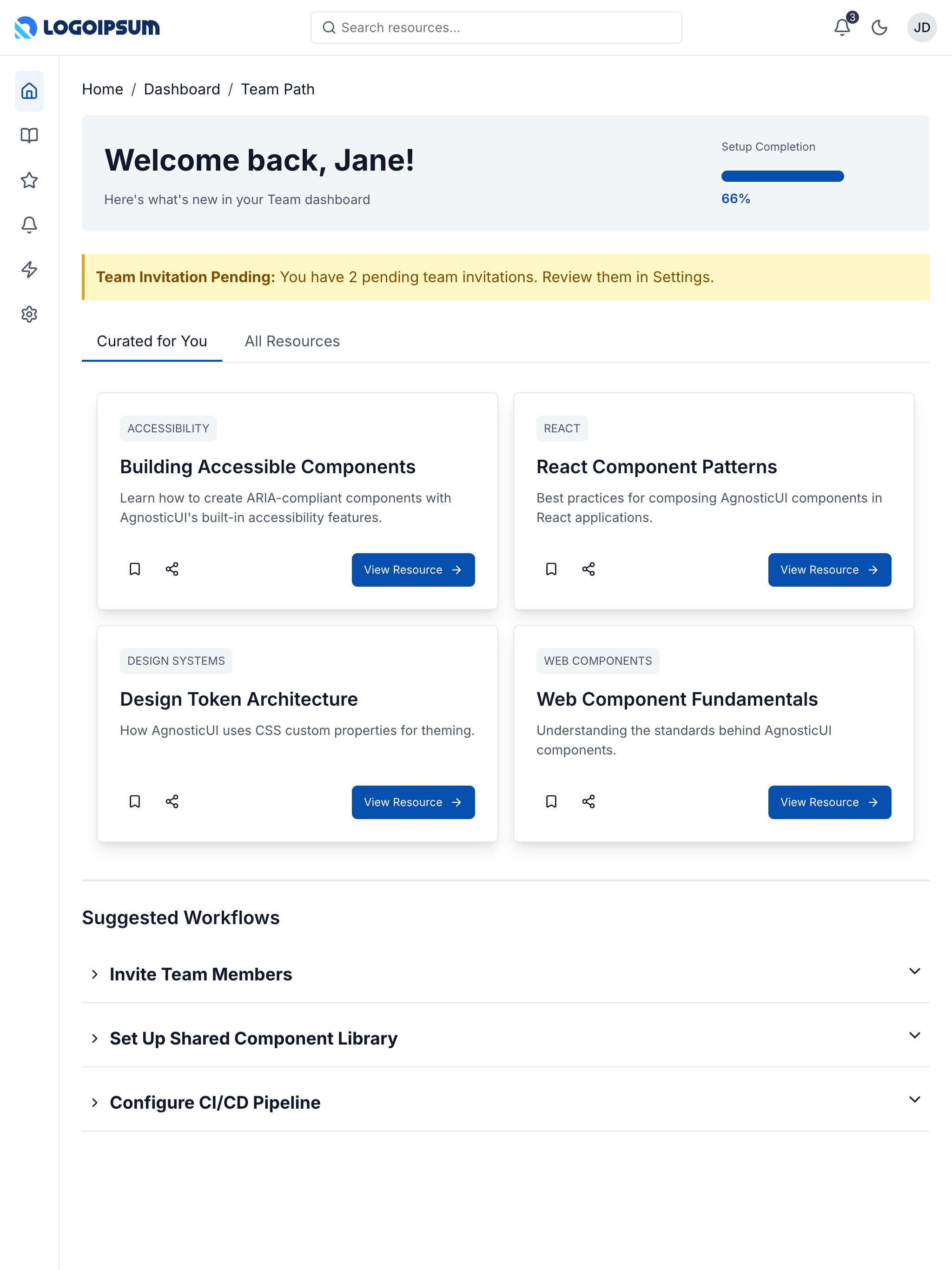
Desktop
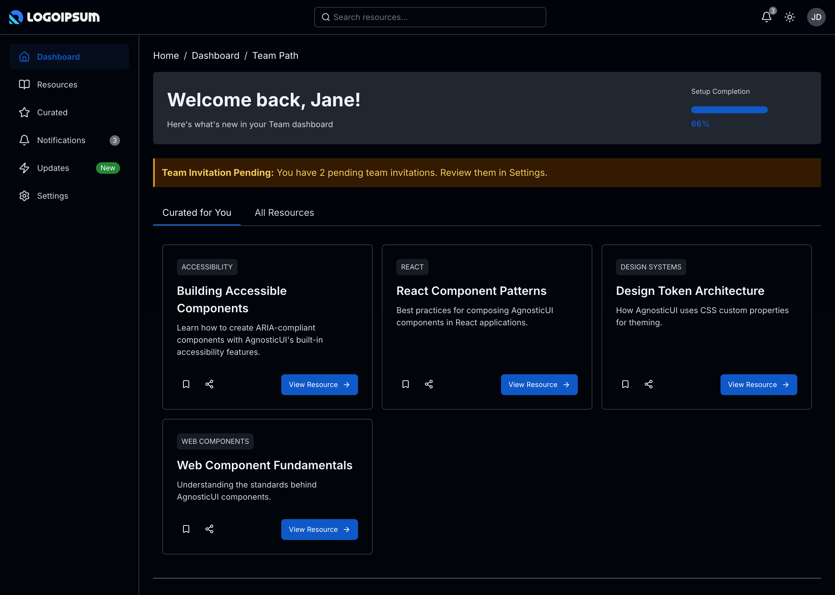
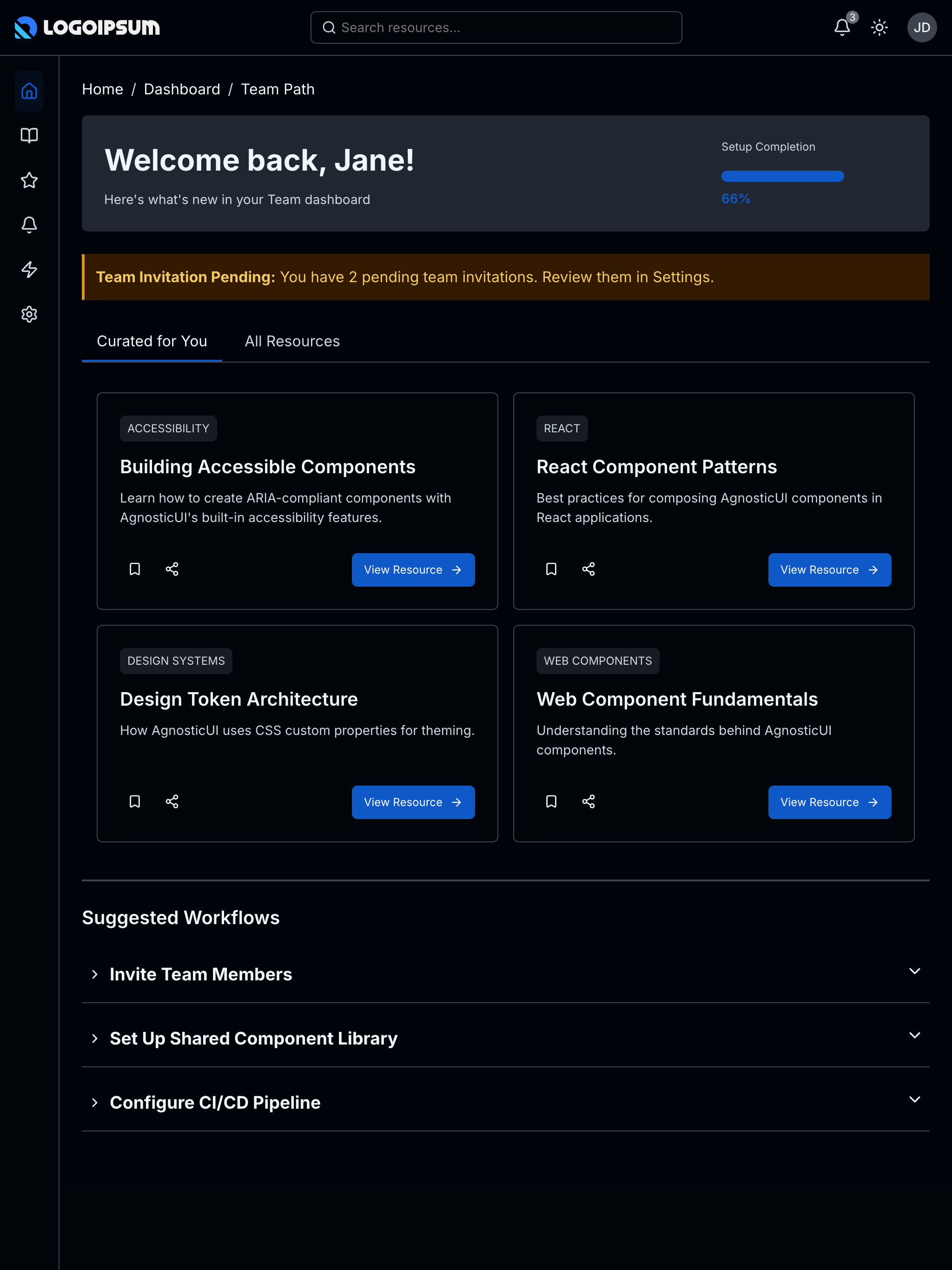
Desktop - Dark
Skins & Customization
Screenshots show the default skin. Each live example includes a skin switcher (bottom-right corner) to preview other themes instantly. Colors, spacing, and typography are fully customizable via design tokens.
What's Included
Experimental Feature: AI-Assisted UI Generation
Generating UI components via LLM prompting is non-deterministic; different models (and even different versions of the same model) can produce drastically varying results from identical prompts.
While these prompts have been tested using the Claude Code CLI (running Claude Sonnet 4.5 and Opus 4.5), the output remains experimental. Always verify generated code for visual consistency, accessibility, and production readiness before deployment.
- Three framework examples: React, Vue, and Lit implementations
- Collapsible sidebar navigation: With branding, nav links, and user profile
- Summary cards: High‑level user info with progress indicators
- Tabbed content areas: Activity feed, resources, and notifications
PROMPT-3-FRAMEWORKS.md: Feed directly to your LLM for AI‑assisted customization
Using with an LLM
The PROMPT-3-FRAMEWORKS.md file contains everything an AI assistant needs to understand and modify the dashboard:
- Copy the
PROMPT-3-FRAMEWORKS.mdcontents - Paste into Claude, ChatGPT, or your preferred LLM
- Ask for customizations: “Add a chart widget to the summary section”
Components Used
| Component | Purpose |
|---|---|
ag-accordion | Collapsible content sections |
ag-alert | Notification and status messages |
ag-avatar | User profile images |
ag-badge | Status indicators and counts |
ag-breadcrumb | Navigation breadcrumb trail |
ag-button | Actions and navigation triggers |
ag-card | Content containers for summary items and widgets |
ag-divider | Visual separators between sections |
ag-empty-state | Placeholder for empty data areas |
ag-flex | Layout containers for responsive grid |
ag-header | Top navigation bar |
ag-icon-button | Icon-only action buttons |
ag-progress | Progress indicators for user activity |
ag-sidebar | Collapsible side navigation |
ag-skeleton-loader | Loading state placeholders |
ag-tabs | Tabbed content switching |
ag-tag | Category and status labels |
ag-toast | Transient notification messages |
Responsive Behavior
| Breakpoint | Layout |
|---|---|
| Mobile (<768px) | Sidebar hidden, hamburger menu, stacked cards |
| Tablet (768–1199px) | Collapsed sidebar, two‑column card grid |
| Desktop (≥1200px) | Full sidebar, multi‑column layout |